Gallery of Ugly Box Art: Suikoden
Posted Feb 23, 2026
There are some unfortunate box art that have been made for the English localizations of RPGs. Some are bad because they misrepresent the RPG like The Guardian Legend. Others have straight up hideous art that I have no clue how they could've decided that it was better than the Japanese other than "these dumb Americans don't like anime!! They like generic fantasy chads!!"
I ended up encountering the most appalling examples recently with the North American Suikoden box art.
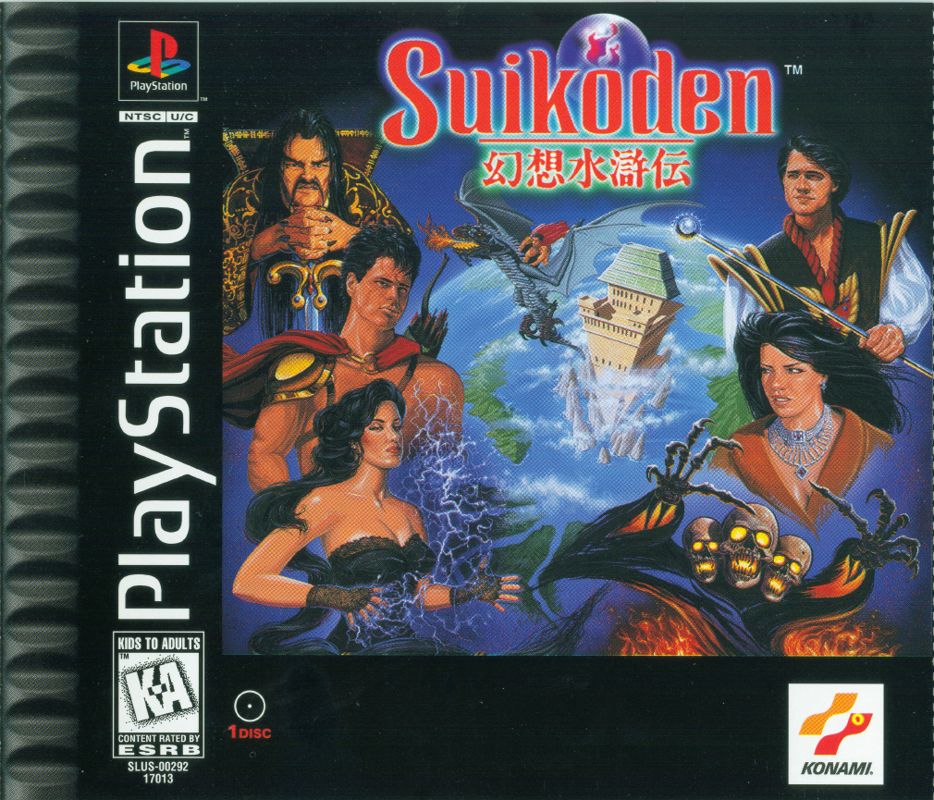
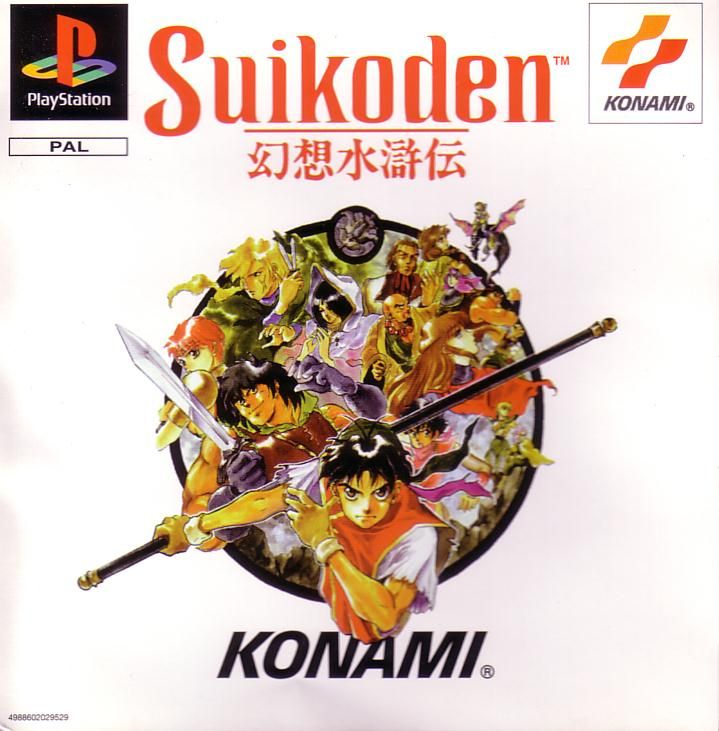
I mean look at this thing, it's one of the ugliest things ever. You wouldn't ever guess the game was based on Chinese mythology other than the Chinese text and the Jackie Chan level depiction of what I can only assume to be Emperor Barbossa? North America is the only region that got this box art, everywhere else either just got the Japanese art or a edited version of it.
Imagine you're shopping for a new game for your PS1, you look at the store shelf and have to chose between what looks like to be a cover of a home brew ttrpg or some other cooler looking thing like Toshinden. I don't know who would think the NA art looks cooler and more appealing than the original JP.
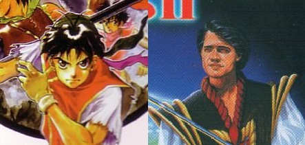
It pains me to look at Junko Kawano's art compared to this garbage.
|